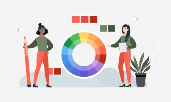
Web Design Color Trends for 2026
In 2026 web design, color is less about “pretty palettes” and more about systems: colors that adapt across light/dark modes, support accessibility, render beautifully on OLED screens, and scale across brand touchpoints. In other words, web design color trends 2026 are about emotion, performance, and usability, often in the same UI.
A big headline for the year: Pantone’s 2026 Color of the Year is Cloud Dancer (PANTONE 11-4201), a soft, airy white that signals “reset,” clarity, and calm, perfect timing for a world of overstimulation.
Key Takeaways
- Accessibility is non-negotiable: contrast, states, focus indicators, and non-color cues must be baked in.
- Neutrals lead in 2026, with Pantone naming Cloud Dancer (PANTONE 11-4201) as Color of the Year.
- Gradients are cinematic and layered (soft-glow, mesh, ambient lighting), not harsh rainbow blends.
- Dark mode evolves into “mood mode,” with designed palettes and tokens that invert colors every time.
- Neon is back as a micro-accent, especially in SaaS and tech-forward UI.
- Generative AI palettes push iridescence and “impossible” combos, best handled with strict brand guardrails.
2025 Web Design Color Trends: Shaping Tomorrow’s Aesthetics
In web design, color is more than an aesthetic tool—it’s a strategic asset. Studies show that 93% of buyers focus on visual appearance, and color influences 85% of purchasing decisions. In 2025, this influence extends even further as digital environments become more immersive and users demand experiences tailored to their emotions and values.
Why Color is Key
- User Engagement: Vibrant, intentional palettes capture attention and reduce bounce rates.
- Conversion Rates: Strategic color choices increase CTA clicks by up to 34% (source: HubSpot).
- Accessibility: With 15% of the global population living with disabilities, accessible color design is no longer optional.
2025 Color Trends in Web Design: An In-Depth Analysis
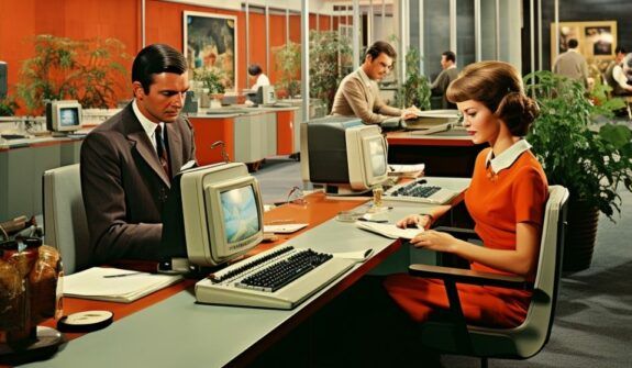
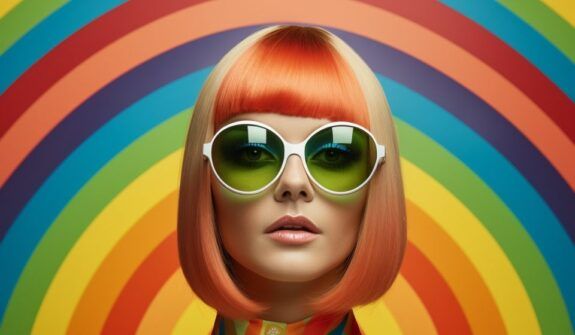
1. Vibrant and Bold Palettes: Dynamic Experiences That Demand Attention
Bold colors like electric blue, fiery red, and vivid orange are dominating 2025 designs. These hues evoke energy, urgency, and enthusiasm—qualities crucial in competitive industries like tech, entertainment, and fashion.
Key Applications:
- Emotional Impact: Intense colors trigger visceral reactions, compelling users to act.
- CTAs: High-conversion designs often rely on vibrant buttons and banners.
- Industries Benefiting: Entertainment, fitness, fashion, and gaming.
Case Study:
Nike’s 2025 redesign utilizes a mix of vivid red and stark black for its new “Move Faster” campaign, driving a 45% increase in user interactions.
2. Chromatic Gradients: From Flat to Multi-Dimensional
Gradients have evolved, combining complexity and depth to create immersive digital interfaces. In 2025, designers use layered transitions—blending purples, pinks, and blues—to simulate movement and interactivity.
How They Work:
- Dynamic Backgrounds: Gradients replace flat colors, making sites feel alive.
- 3D Effects: Enhanced gradients create depth, mimicking real-world textures.
- Industries Benefiting: Gaming, SaaS platforms, and creative portfolios.
Pro Tip: Combine gradients with micro-interactions to amplify user engagement.
3. Muted Neutrals Paired with Bright Accents
Soft, muted tones like taupe, beige, and pastels are making a comeback, offering understated elegance and user comfort. When paired with vibrant accents—such as neon yellow or coral—these palettes create harmony with a pop of excitement.
Where They Excel:
- Wellness Brands: Muted tones evoke calmness, perfect for mindfulness apps.
- Interior Design: Subdued colors appeal to audiences seeking sophistication.
- Fashion Sites: Bright accents juxtaposed with muted backgrounds highlight products.
4. High-Tech Metallics and Chrome
Metallic tones like silver and chrome dominate futuristic designs in 2025. These finishes, paired with dark mode, create a sleek, luxurious aesthetic.
Key Features:
- Reflections in Dark Mode: Chrome’s reflective properties make elements pop.
- CTAs and Navigation: Metallics emphasize critical components subtly.
- Industries Benefiting: Automotive, technology, luxury goods.
Advanced Tip: Use 3D renderings with metallic tones to create hyper-realistic product showcases.
5. Nature-Inspired Tones: A Testament to Sustainability
Earthy tones like forest green, clay, and ocean blue are rising as symbols of sustainability and authenticity. These palettes align with the eco-conscious values of Gen Z and Millennials.
Applications:
- Eco-Friendly Brands: From organic skincare to outdoor gear, these tones resonate.
- Sustainability Messaging: Paired with eco-themed icons, they build trust.
Data Insight: Websites using green tones report a 20% increase in trust scores among users under 35 (source: Nielsen).
6. Optimistic Pastels and Retro-Futurism
Playful pastels are evolving, inspired by early 2000s nostalgia and futuristic minimalism. Lavender, blush, and mint green combine warmth and innovation, making them a favorite for both lifestyle and tech brands.
Why It Works:
- Nostalgia Meets Innovation: Perfect for bridging generational gaps.
- Industries Benefiting: Beauty, lifestyle, and SaaS platforms.
7. Monochrome with a Modern Twist
Monochrome palettes—featuring black, white, and shades of gray—continue to exude timeless sophistication. Small bursts of vibrant colors—turquoise or hot pink—keep these designs modern and engaging.
Pro Tip: Use monochrome for finance, legal, and corporate websites, but add subtle color pops to highlight CTAs.
Trend 1: “Cloud Dancer”: Neutrals & Soft Whites as the New UX Foundation
Instead of stark #FFFFFF interfaces, 2026 leans into whites with a subtle warmth/cool balance, which reduces glare, improves perceived quality, and lets typography and product imagery breathe. Pantone explicitly frames Cloud Dancer as a calming, versatile neutral “blank canvas” that pairs well with pastels, blues, or deeper plums/browns.
Palette A — Cloud Dancer Core (digital-first neutral stack)
Swatches (approx. sRGB/HEX):
- Cloud Base: #F0EEE9 (screen-friendly approximation for Cloud Dancer)
- Warm Paper: #F7F3EE
- Ink: #141414
- Slate UI: #2B2F36
- Soft Accent (Mist Blue): #BFD3E7
Where it wins:
- Luxury / Real estate: Cloud Base backgrounds + Ink type + Mist Blue accents for “quiet confidence.”
- Wellness/healthcare: Warm Paper + Slate UI + one calming accent → less clinical, more human.
- DTC ecommerce: Neutral product stages that make imagery pop without looking “template-y.”
Trend 2: Cinematic Gradients: Soft-glow > Rainbow Overload)
Gradients in 2026 aren’t the harsh neon blends of past cycles. They’re smoky, ambient, and layered, used as lighting, not decoration. Expect more gradient meshes, blurred glow fields, and subtle motion in hero sections.
Palette B — Soft-Glow Gradient (hero backgrounds + section dividers)
- Night Plum: #2B1538
- Dusk Violet: #5A4B8A
- Haze Blue: #88A3D6
- Cloud Fade: #EDE7E3
- Ember Accent: #FF6A3D
Trend 3: Dark Mode Becomes “Mood Mode” (Think Designed, Not Inverted)
Dark mode is now expected, and in 2026, the best sites treat it as an intentional brand expression, not a toggle. The key is building a palette that holds contrast, keeps CTAs visible, and avoids “grey-on-grey fatigue.” Lastly, make sure you’re meeting WCAG contrast guidelines; 4.5:1 for standard text is the baseline most teams target.
Palette C — Mood Mode Dark (product UI, dashboards, SaaS)
- True Charcoal: #0B0D10
- Surface: #151A21
- Border: #273140
- Text: #E9EEF5
- Accent (Electric Cyan): #40E0FF
Brand usage examples:
- Fintech / cybersecurity: Charcoal surfaces + Electric Cyan as “trust through precision.”
- Media / entertainment: Dark UI + bright accents for “immersive viewing.”
Trend 4: Neon Accents
Neon is back, but smarter: it shows up as micro-glow accents, focus states, small badges, and CTA outlines against dark surfaces. Think “controlled energy,” not highlighter chaos.
Palette D — Neon Minimal (accents, tags, highlights)
- Black Glass: #070A0F
- Neon Lime: #B6FF3B
- Laser Pink: #FF3BD4
- Signal Blue: #3B7BFF
- Neutral Type: #E6E8EE
Where to use neon effectively:
- CTA hover/focus rings
- “New” / “Beta” / “Live” tags
- Small gradient strokes behind headlines (not full backgrounds)
Trend 5: Generative AI palettes
AI-designed visuals are pushing palettes toward iridescent, metallic, and “hyperreal” color relationships, colors that feel computational rather than traditional. The winning approach in 2026 is: generate fast, then constrain hard (define brand guardrails and accessibility tokens, then let AI explore within them). Signals for this “AI-meets-organic” direction have been building across creative trend reporting.
Palette E — AI Iridescence (tech brands, launch pages, innovation content)
- Void: #07070A
- Holo Lilac: #B9A7FF
- Plasma Teal: #00F5D4
- Ion Gold: #FFD66B
- Quartz: #F3F0FF
Trend 6: Teal + Earth = “Eco-Digital”
Alongside Cloud Dancer’s reset energy, the year also loves blue-greens, especially Transformative Teal, as named by WGSN/Coloro for 2026, positioned around change, resilience, and an Earth-first mindset.
Palette F — Eco-Digital (sustainable brands, outdoor, wellness, climate-tech)
- Transformative Teal (approx.): #316263
- Moss: #3E5C47
- Clay: #C36A4A
- Sand: #E7D8C6
- Deep Ink: #101417
Trend 7: Modern Reds Echos Confident Warmth
Deeper reds are trending as “serious warmth,” less aggressive than bright red, more premium than rust. Paint + brand forecasts are reinforcing this direction (ex: PPG’s 2026 Color of the Year, Warm Mahogany).
Palette G — Warm Mahogany Web (hospitality, lifestyle, premium ecommerce)
- Dusty Rose: #D7A3A1
- Warm Mahogany (anchor): #7A2E2A
- Cream: #F5EFE7
- Espresso: #221A18
- Brass: #C9A46B
How to Apply 2026 Palettes Without Breaking Your Brand or Your UX
1) Build color as a token system
Don’t pick “a palette.” Pick:
- Base tokens
- Semantic tokens
- Theme tokens
2) Design for accessibility from day one
Aim to meet WCAG contrast expectations (notably 4.5:1 for standard text as a common baseline) and don’t rely on color alone to communicate errors or states.
3) Use gradients/neon as hierarchy tools
- Gradients: best for hero mood, section transitions, feature highlights
- Neon: best for tiny emphasis (CTA focus, badges, interactive states)
Summary
The best web design color trends 2026 aren’t just about what looks modern; they’re about what scales across devices, modes, audiences, and content types. Use Cloud Dancer-style neutrals to create calm foundations, lean on cinematic gradients for emotion, treat dark mode as a deliberate theme, and deploy neon/AI palettes as controlled accents. When color becomes a system, tokenized, accessible, and brand-aligned, you get aesthetics and performance.
If you’re looking to upgrade the look and feel of your UX, contact Lounge Lizard and a brandtender will reach out to you with more information on how you can implement the latest color trends on your website in 2026.
FAQS