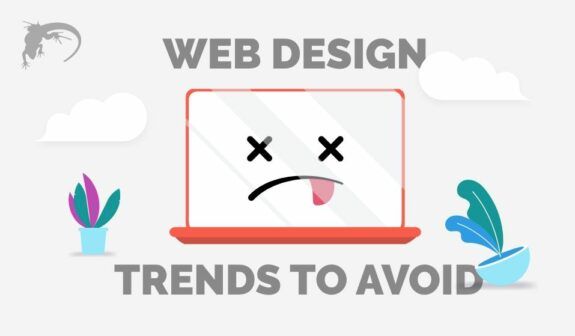
Top 5 Bad Website Design Trends You Need to Avoid & 3 to Try Immediately!
While beauty is in the eye of the beholder, ugly is generally agreed upon unanimously!
Your website design presents your business brand and introduces you to the world. Today, online business and ecommerce is more important than ever — you can’t afford to have a poor website design that sends the wrong message about your company or your product.
What Makes a Bad Website Design?
Along with being visually unappealing, bad website design is ineffective. It often causes people to leave your site and immediately jump back to the search engine results pages (SERPs), increasing your bounce rate and impacting your rankings. It literally can cost you sales.
Of course, in most cases awful website design trends are just that, a trend — something that seemed appealing at the time, but now has been shown to be ineffective, which is not what you want for your website.
Who can forget the old www.arngren.net site that was a jumbled mass of products and links? It probably seemed like a good idea at the time but has become the recognized standard for what not to do.
Today, good website design incorporates ever-improving technical capabilities along with strong visual elements to direct users through your website and along a sales funnel. The goal after all is to engage viewers and then get them to convert is some way or another. With that in mind, it’s more beneficial to focus on functionality and the overall user experience.
5 Website Design Trends to Avoid
Let’s take a look at five bad website design examples or trends that just don’t work. They all have one thing in common — they cause aggravation for the user. Just like in a brick and mortar store, you want to make the flow as smooth and barrier-free as possible to gently guide your visitor to checkout with their purchases in tow.
Bad website design, like a bad store layout, can frustrate the consumer and cause them to shop elsewhere. Avoid these five trends to keep your customers coming back to your website.
1. Pop-Ups
This is by far one of the worst web design faux pas and is still being used today.
To start, pop-ups are meant to grab the user’s attention, but they completely disrupt the visual look and feel of a site.
Second, they are highly ineffective (not to mention annoying). Ask yourself a question; when was the last time you actually read a pop-up ad?
Most people look at them long enough to find the “X” button. The use of even one pop-up can cause users to bounce from your website simply because they don’t want to deal with the interruptions.
There are more effective ways to get a user to sign up for a newsletter or to announce an upcoming sale!
2. Auto-Play Videos
Right behind pop-ups in the ‘annoying category’ is auto-play videos.
Over 60% of online time is spend on mobile devices which means that people can be using them anywhere. The last thing they want is a loud ad or video unexpectedly appearing on a site they just visited. It’s distracting and reflects negatively on your site and your product.
And let’s be honest, who hasn’t been online at work and visited a site that was not ‘work-related’ only to have a loud announcement echo around the office? We bet you avoided that site in the future, right?
3. The Flash Intro
The Flash Intro is a short animation (usually accompanied by music) that lasts from a few seconds to a minute or longer and must be viewed before you can enter the website. It grew in popularity a few years ago when designers saw it as a great opportunity to add some flair for a captive audience.
The problem is — the audience isn’t captive…and they want instant gratification! If they are new to your site, a flash intro can cause frustrated users to bounce back to the SERPs. If they have been to your site before and know what they want, a flash intro can be a barrier to a sale by causing unnecessary annoyance and reflecting poorly on your company.
4. Stock Photos
Stock photos are a sign of bad website design. It’s one thing used on the blogs or posts, but something else entirely when used as the visual elements of the site itself.
While a few sprinkled throughout your site is ok — the photos from stock image companies tend to be expensive and the free sites are sharing photos that may not meet professional standards.
It’s far better to use images that include your worksite, projects, and team members to lend a more authentic feel to your site and create a trust builder with site visitors. Like using customer testimonials and case studies, professional images of your business help a potential customer gauge your brand, authenticity, and trustworthiness — all important things when committing to a purchase.
So, spend the money on a professional photo shoot. It will pay big dividends overall.
5. Bad Parallax Scrolling
Parallax scrolling can be a great technique when done right. When done wrong it can be confusing to users, which you don’t want.
Consider these problems that can arise from bad parallax scrolling:
- It slows down your website and increases load time. With Google’s Core Web Vitals being the gold standard, you want a website that is responsive, mobile friendly, and FAST! Bad parallax scrolling will slow down your site speed and negatively impact your SERP rankings.
- It makes your site difficult to track with analytics which are key to making improvements, testing effectiveness, and monitoring changes.
- It simply doesn’t work on mobile — enough said!
Don’t be disheartened. There are tons of cool website design options available to make your site unique and effective. Here are three of our favorites.
3 Trends to Incorporate in Your Good Website Design
When looking for website design inspiration, keep these three ideas front of mind:
1. Color, Color, Color, and White Space
Strong website design layout will often use color — bold and vivid color demonstrates strength and vitality. Softer colors usually signify calm, wellness, and a relaxing vibe. You aren’t going to sell extreme sports adventure packages with a pale pink and soft green color palette. That might be more appropriate for a day spa or yoga studio.
While the color palette is important to define your message, you still want a lot of white space to create a clean, uncluttered landscape that’s easy to read and absorb. So, use plenty of both to maximize your site’s effectiveness.
2. Illustrations That Pop
When you are designing a new website, you want to work with the top designers and developers available. Add to that list — a top illustrator! You want someone who can create spectacular digital illustrations that convey your brand message as well as lead your customer down the page.
Whether you use an illustrator that is expert in hand-drawn art or someone skilled in digital software illustration, you want your site to have a unique and one-of-a-kind look that your visitors won’t find anywhere else.
3. Accessibility
On the whole, we are a country that’s all about inclusion! By ensuring your website design incorporates accessibility, you are sending the message that inclusion is important to you and your business.
From vision impairments to auditory, cognitive, and motor challenges, the best website designs incorporate experiences that make navigation streamlined for the 15%+ of the population that interacts with online sites from a different perspective.
The Bottom Line
While trends can make a site look fresh and seem relevant, it typically comes with an expiration date. Using outdated trends, especially ones that are ugly or ineffective is a mistake that can easily affect your conversion rate.
After reviewing our Top 5 Bad Web Design Trends, you should be able to determine if your site needs adjustments to ensure that your clients have an optimal experience.
Whether looking to improve an existing site or starting from square one, don’t rely on do-it-yourself website design. Website design services are far too important to leave to inexperienced or unskilled people. You want a website design company with years of proven digital marketing and website design experience.
Contact Lounge Lizard to learn more about our design and development services and view our website design portfolio here.