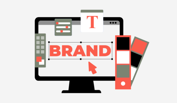
Font Trends 2026 + Top 12 Trending Fonts
Typography keeps leveling up, and in 2026, it’s one of the most powerful tools you have for shaping how people feel about your brand. With AI-generated typefaces, kinetic typography, 3D fonts, and advanced variable fonts now part of everyday design workflows, the phrase “font trends 2026” is about much more than aesthetics. It’s about performance, accessibility, and storytelling across every digital touchpoint.
Whether you’re working on a full rebrand, a new website, or a paid media campaign, understanding the latest font trends 2026 will help you create brand experiences that feel fresh, future-ready, and unmistakably yours.
Key Takeaways
- 2026 is the year of intelligent type
The top font trends 2026 include kinetic typography, 3D fonts, advanced variable fonts, and AI-generated typefaces that adapt to context, device, and user behavior. - Accessibility + aesthetics, not one or the other
Fonts that are clean, legible, and inclusive, especially on mobile, are now non-negotiable. Brands are prioritizing type that meets WCAG/ADA guidance while still feeling distinctive. - Motion and depth are now mainstream
Kinetic typography (animated and responsive text) and 3D fonts are being used in branding, web experiences, and digital ads to guide attention and create immersive storytelling. - Custom and AI-assisted type systems are rising
Instead of relying on one generic font, brands are building font systems, often developed or refined with AI, to cover logos, UI, social content, and campaigns consistently. - 2026 typography is more strategic than 2025
Compared to 2025, font choices in 2026 are more data-informed, performance-aware, and integrated with motion, accessibility, and brand differentiation.
2025 vs. 2026 Typography Trends: What Changed?
Font trends evolve fast. Here’s a quick comparison of 2025 vs. 2026 typography trends so you can see how the landscape shifted:
In 2025, typography focused on:
- Early adoption of AI-crafted fonts and adaptive type experiments
- Growing awareness of accessibility-focused fonts
- Initial use of AR/VR typography in niche experiences
- Variable fonts mainly for performance and responsive design
- Popularity of retro-futuristic displays in tech and entertainment
In 2026, typography has matured into:
- AI-generated typefaces as a standard tool, not a novelt
- Kinetic typography integrated across web, apps, and video (scroll-reactive, hover states, micro-animations)
- 3D fonts are used not only in AR/VR, but also in hero sections, brand systems, and social ads
- Variable fonts with richer axes (tone, optical size, motion-ready variants
- Accessibility baked in from day one—font choices vetted for contrast, legibility, and neurodiversit
- Neo-nostalgic, retro-futuristic fonts are used more strategically as accent styles rather than full UI solutions
Bottom line:
2025 felt experimental; 2026 font trends feel integrated and scalable. Typography is now a core part of product design, branding, and performance marketing, not just a visual garnish.
The Top Font Trends for 2026
1. Variable Fonts as the Default, Not the Exception
Variable fonts have officially crossed the line from “trend” to “best practice.” In 2026, they’re the backbone of digital typography.
Why they’re trending:
- One file, multiple weights and styles → faster load times
- Smooth transitions between sizes and weights → clean, consistent UI
- Built-in flexibility for dark mode, small screens, and high-density displays
Branding example
A SaaS brand uses a single variable font family for everything: logo, wordmark, marketing headlines, body copy, and dashboards. The result is a cohesive, easily scalable system.
Web example
On a product page, H1s use a bold variable weight, subheads use a semi-bold, and long-form content uses a regular optical size tuned for readability, all from one type family.
Digital ads example
Dynamic ad templates adjust font weight and width automatically depending on character count and placement, keeping creative on-brand and legible across placements.
2. AI-Generated Typefaces & Smart Type Systems
AI isn’t just generating art, it’s shaping type design, too. One of the biggest font trends for 2026 is the rise of AI-assisted custom fonts and smart type systems.
What’s new in 2026:
- AI helps generate brand-specific letterforms, which designers refine
- Intelligent suggestions for weights, spacing, and alternates based on use case
- Rapid prototyping of multiple styles for different verticals or audiences
Branding example
A DTC brand uses an AI-assisted custom typeface that blends geometric sans with soft, humanist curves. The font is unique to the brand but still accessible and web-safe.
Web example
A global enterprise platform uses an AI-informed type system that automatically optimizes line length, spacing, and weight for different regional sites and languages.
Digital ads example
AI-generated display fonts power campaign-specific headlines, allowing the same brand to run multiple concepts that feel related but distinct across channels.
3. Kinetic Typography: Motion as a Design Language
Kinetic typography, text that moves, reacts, or animates, is a standout addition to font trends in 2026. It goes beyond animated titles; type now responds to user interaction, scroll depth, or audio.
Key characteristics:
- Micro-animations on hover, click, or scroll
- Subtle shifts in weight, tracking, or color to guide attention
- Syncing type with audio/voiceover in video and interactive content
Branding example
A brand’s wordmark has a motion version for video and social intros: letters slide into place or subtly expand before settling into the static logo, reinforcing recognition.
Web example
On a landing page, the hero headline animates slightly as users scroll, with each line sliding in or subtly shifting weight, just enough to feel alive without harming performance.
Digital ads example
Short video ads and social reels use kinetic typography to highlight key phrases. The type animates in sync with beats or transitions, making the message more memorable in silent autoplay feed environments.
4. 3D Fonts & Immersive Type
3D and depth-driven typography were once reserved for hero graphics and experimental portfolios. In 2026, 3D fonts are more refined, accessible, and integrated into everyday design.
Why 3D fonts matter now:
- Pair seamlessly with AR product visualization and virtual showrooms
- Add depth to hero headlines and banners without resorting to overused effects
- Can be rendered in both static and motion formats for cohesive campaigns
Branding example
A gaming or tech brand uses a semi-3D logotype for key visuals (launch campaigns, splash pages, packaging) while keeping a 2D version for small-scale and UI uses.
Web example
A homepage hero uses a 3D-rendered headline that appears to sit within the scene (e.g., hovering above a product image), while body copy remains flat and highly legible.
Digital ads example
Display banners and social ads feature 3D words like “SALE” or “NEW” rendered in the brand palette, adding dimensional impact while pairing with a clean sans serif body font.
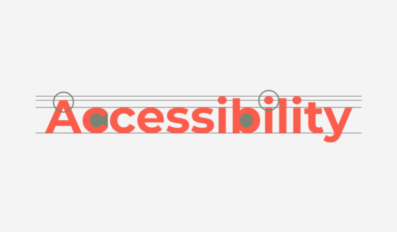
5. Accessibility-First, Brand-Ready Sans & Serifs
Trendy fonts are useless if people can’t read them. In 2026, brands are doubling down on accessibility-first typography while still pushing visual identity.
Core traits:
- Clear differentiation between similar characters (I/l/1, 0/O)
- Adequate x-height and open counters for on-screen readability
- Strong performance in both light and dark modes
- Families that include accessible weights and styles for UI, body copy, and captions
Branding example
A financial services company picks a modern serif for headlines and a highly readable sans serif for body copy. Both were vetted for accessibility and tested across mobile, desktop, and TV.
Web example
Design systems document minimum font sizes, line heights, and color contrast ratios for every text style. Designers can’t publish non-compliant combinations.
Digital ads example
Paid campaigns use accessible font pairings even in small sizes (e.g., remarketing banners, app install ads) to maintain legibility on cluttered feeds and tiny placements.
6. Retro-Futuristic & Neo-Nostalgic Display Type
Retro-futurism isn’t going anywhere; it’s just getting smarter. In font trends 2026, nostalgic display faces are used in a more strategic, restrained way.
Trademarks of 2026 retro-futurism:
- Hints of early PC and arcade aesthetics paired with clean modern layouts
- ’70s–’90s sci-fi influences in rounded forms, monospacing, or angular cuts
- Limited use in headlines, logos, and hero graphics, not full paragraphs or UI
Branding example
A streaming or gaming brand uses a retro-futuristic display font for its logotype or campaign slogan, paired with a neutral sans serif for daily use.
Web example
Section headers and key callouts use a retro-futuristic display font for personality, while all functional text (forms, navigation, paragraphs) stays in a clean sans serif.
Digital ads example
Launch campaigns leverage nostalgic display fonts for standout hero text (“Level Up,” “Next Gen,” “Reboot Your Routine”), then keep supporting copy neutral and legible.
12 Popular Fonts to Explore in 2026
Here’s a curated list of 12 fonts to explore within font trends 2026, aligned with kinetic, 3D, variable, and AI-driven directions:
- Grayson Nova – A flexible sans serif with multiple variable axes, ideal for modern product brands and scalable design systems.
- Harmony Bold – A strong serif for headlines and branding that pairs nicely with clean sans body text.
- Spring Eclipse – A refined display serif with elegant curves, excellent for editorial hero text and social graphics.
- Frutiger Next – A refreshed classic with extended language support and variable options for UI/UX.
- Bariol Neo – Warm, approachable, and great for friendly brands in tech, health, or education.
- Isabella Luxe – Minimal and fashion-forward, perfect for beauty, luxury, and lifestyle brands.
- Zorina Pro – High-contrast, distinctive display type ideal for packaging and premium landing pages.
- Pandyra Adaptive – An AI-informed, variable typeface designed to adjust weight and contrast based on context, which is ideal for accessible design systems.
- Kisba Nova Ultra – A bold serif built for impactful editorial and campaign headlines.
- Maxi Fluid – A dynamic variable font with expressive weights that works beautifully in kinetic typography and motion-driven layouts.
- Sirenia Bloom – Organic and decorative, great for lifestyle, wellness, and boutique brand identities.
- Exposure 2.0 – An experimental display typeface with extended axes, which is fantastic for 3D treatments, motion titles, and AR/VR interfaces.
Font Showcase Visuals & Usage Examples
To bring these font trends 2026 to life in your blog or presentation, incorporate visual showcases like:
1. Branding Lockup Example
- Font pairing: Harmony Bold (headline) + Bariol Neo (body)
- Visual:
- Top: Logo + tagline using Harmony Bold
- Middle: Business card + letterhead mockups
- Bottom: Social profile header and avatar showcasing the brand wordmark
2. Web Homepage Hero Example
- Font pairing: Grayson Nova (H1/H2) + Frutiger Next (body and navigation)
- Visual:
- Hero banner with bold Grayson Nova H1 and a slightly lighter H2
- UI elements (buttons, menus) using Frutiger Next
- Inset showing dark mode vs. light mode typography
3. Kinetic Typography Ad Example
- Font pairing: Maxi Fluid (animated headline) + Isabella Luxe (supporting copy)
- Visual:
- Short video mockup for a social ad where “New Collection” animates using kinetic type
- Supporting CTA (“Shop Now”) remains clean and static for clarity
4. 3D Font Campaign Example
- Font pairing: Exposure 2.0 (3D-rendered headline) + Zorina Pro (secondary)
- Visual:
- 3D “SUMMER SALE” headline rendered in brand colors
- Overlaid on a simple product scene, with flat Zorina Pro text below
You don’t need to show every font in motion or 3D, but using a few side-by-side examples (branding/web/ads) helps clients and stakeholders see how each font trend actually works in the real world.
How to Choose the Right Fonts for Your Brand in 2026
When you’re evaluating font trends 2026 for your brand:
- Start with strategy, not style
Define who you are, who you serve, and where your brand lives (web, app, retail, AR, etc.) before making any decisions. - Build a small, powerful type system
A primary sans serif, a complementary serif or display font, and a motion-friendly/variable option are often enough. - Test for accessibility and performance
Check contrast, legibility, mobile readability, and load times. Don’t let a “cool” display font tank UX. - Think in motion and 3D, even if you’re not there yet
Choose fonts that can work in static, motion, and 3D contexts so you’re future-ready as your brand evolves. - Stay consistent across branding, web, and ads
Your logo, website, and digital ads should clearly feel like they belong to the same brand, even if each uses different facets of your type system.
At Lounge Lizard, we help brands turn typography into a strategic asset, everything from selecting fonts and building design systems to designing websites, apps, and campaigns that bring those choices to life. Contact us today to learn how your business can benefit from 2026 font trends.
Summary
The top font trends for 2026 signal a shift toward smarter, more integrated typography:
- Variable fonts are now the default for digital-first brands.
- AI-generated typefaces help designers create distinctive, scalable systems.
- Kinetic typography turns motion into a core part of UX and storytelling.
- 3D fonts and immersive typography support AR/VR and visually rich campaigns.
- Accessibility-first typography ensures fonts look great and work for everyone.
Compared to 2025, font trends 2026 are more strategic, more accessible, and more tightly woven into branding, web UX, and digital advertising. Designers who lean into these trends are better positioned to create memorable, high-performing experiences that stand out in a crowded digital landscape.
FAQ
- Does this typeface reflect our brand personality?
- Can it work across logo, web, and ads without breaking?
- Does it meet accessibility standards?
- Can it grow with our future needs (motion, 3D, global expansion)?